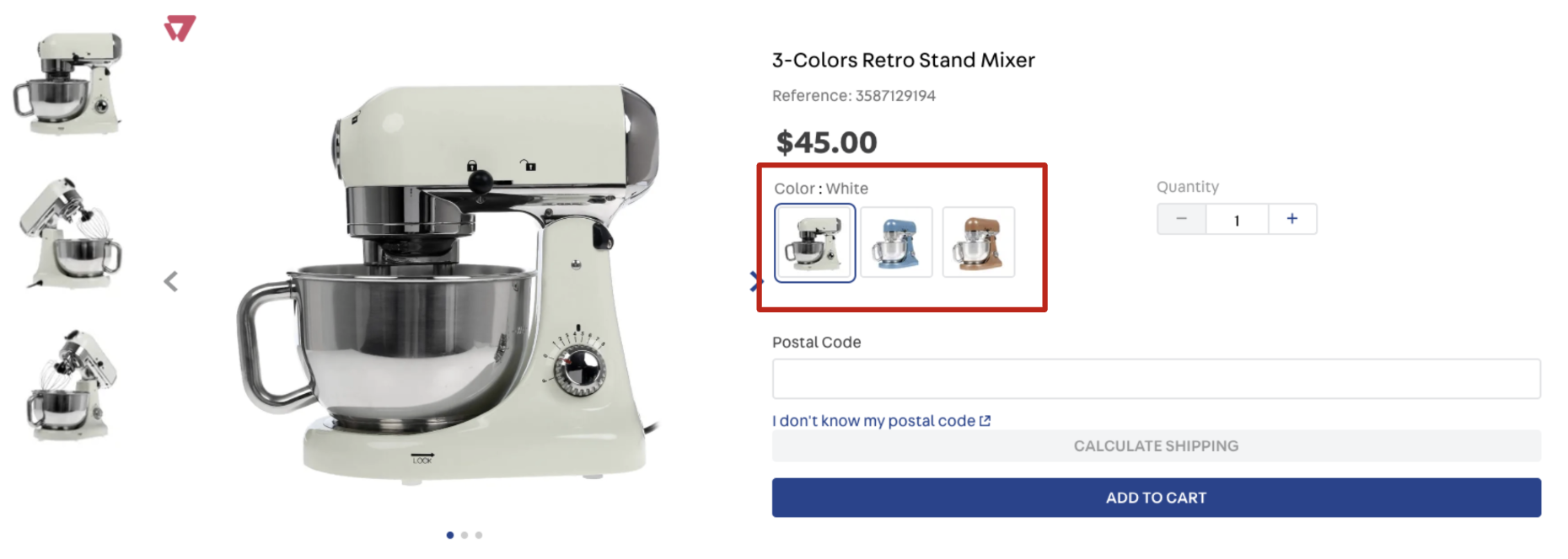
SKU Selector
📢 Disclaimer Don't fork this project. Use it, contribute to it or open issues through Store Discussion to help us evolve it.
SKU Selector
The sku-selector block is mainly used in Product Details Pages (PDPs) to display all the SKUs available for a given product.
Configuration
Import the
vtex.sku-selectorapp to your theme's dependencies in themanifest.jsonfile as in the following example:
Add the
sku-selectorblock to any child of thestore.producttemplate (product page). For example:
Then, declare the
sku-selectorblock using the props stated in the Props table. For example:
sku-selector
XXXXX
summary-sku-selector
XXXXX
sku-quantity
XXXXX
sku-selecor and summary-sku-selector props
sku-selecor and summary-sku-selector propsclasses
CustomCSSClasses
Overrides default CSS handles. To better understand how this prop works, checkthis document. Note that this is only helpful if you're using this block as a React component.
undefined
disableUnavailableSelectOptions
boolean
Whether a product variation that leads to an impossible product combination should be displayed with the disabled attribute whendisplayMode is set to select. By default, all select options are without the disabled attribute set based on the type of variation
false
displayMode
enum
Defines how the product variation names will be displayed (it doesn't apply to product variation images). Possible values are:default (displays all variation names), select (only displays the selected variation name) or slider (displays all variation names in a slider when the number of available options in greater than the value defined in the sliderDisplayThreshold prop). Notice that this prop is responsive, so you can declare an object as its value specifying a value for each breakpoint (desktop and mobile).
default
hideImpossibleCombinations
boolean
Defines if a product variation should be clickable (true) or not (false). If true, the variation won't be displayed. If false, the variation is displayed with less opacity. For example, there are two colors for a pair of sneakers: pink and white, and if the pink sneaker is available for only one size, the other sizes won't be displayed (true).
true
sortVariationsByLabel
boolean
Defines if the variations are to be sorted in alphabetical order.
false
imageHeight
number , object
Height (inpx) of the product thumbnail image. You can declare an object as its value in case you want to define a height for each device (desktop and mobile).
undefined
imageWidth
number ,object
Width (inpx) of the product thumbnail image. You can declare an object as its value in case you want to define a width for each device (desktop and mobile).
undefined
initialSelection
enum
Controls the user initial selection for available variations when product page is fully loaded. Possible values are:complete (selects the first available SKU's variation values), image (selects the first available image variation) or empty (no variations will be selected when the page is loaded).
complete
maxItems
number
Maximum number of variation items to be displayed in the SKU Selector before theSee more button. The button will always be displayed 2 items before the number set in maxItems.
10
showValueForVariation
enum
Displays a value for the selected variation. This prop replaces the formershowValueNameForImageVariation (deprecated). Possible values are: none (no values are displayed when the variation is selected), image (displays only the image value for the selected variation, if any) or all (all variation values are displayed).
none
sliderArrowSize
number
Controls the size (height and width) in pixels of the navigation arrows rendered whendisplayMode is set as slider.
12
sliderDisplayThreshold
number
Minimum number of product variation names that should be displayed usingslider display mode. This prop only properly works when displayMode is set as slider.
3
sliderItemsPerPage
object
Controls how many slides should be shown on each type of device whendisplayMode is set as slider. Check out more information regarding this prop structure below this table.
{desktop: 3, tablet: 2, phone: 1}
showVariationsErrorMessage
boolean
Whether an error message should be displayed whenever theBuyButton is clicked on but no available variation was selected (true) or not (false).
true
showVariationsLabels
enum
Where variation names should be displayed. Possible values are:none (doesn't display the variation names. Replaces the previous false behavior), variation (shows the variation name as a header of the items. Replaces the previous true behavior), itemValue (displays the variation name before with each item's value) and variationAndItemValue (behaves as variation and itemValue at the same time).
variation
thumbnailImage
string
First image to be displayed. This prop value must be the same text string defined in the desired product image'simageLabel field (from the Catalog module). If you use this prop and no image declaring the same text string in its imageLabel field is found, any product image will be randomly rendered instead. To apply the thumbnailImage configuration, see the Configuring custom images for the SKU Selector documentation
undefined
variationsSpacing
number
Defines themargin-bottom size to be applied in the rendered product variations. Possible values are from 0 to 11 (the prop value is not in px, every value represents a tachyons class).
7
visibility
enum
Defines the scenarios in which the SKU selector should be displayed. Possible values are:always (it will always be displayed even if the product has only one SKU option) or more-than-one (the SKU Selector is only displayed when the product has more than one SKU option).
always
visibleVariations
array
Specifies which product variations should be displayed in the product details page. Notice the following: if you declare a name that doesn't represent a real product variation or an empty array, no variations will be displayed. Check out more information regarding this prop structure below this table.
undefined
SliderBlock
Block
Property to receive a slider block.
undefined
message
string
Defines the block's default text i.e. the block message. You can also define which text message a block will render on the UI using the admin's Site Editor.
Selecione {skuField}
markers
[string]
IDs of your choosing to identify the block's rendered message and customize.
[]
visibleVariationsprops
name
string
Product variation name.
undefined
sliderItemsPerPageprops
desktop
number
Number of slides to be displayed on desktop devices whendisplayMode is set as slider.
3
tablet
number
Number of slides to be displayed on tablet devices whendisplayMode is set as slider.
2
phone
number
Number of slides to be displayed on phone devices whendisplayMode is set as slider.
1
sku-quantity props
sku-quantity propsmarkers
string[]
[]
message
string
``
availables vars in sku-quanttiy message
quantity
quantity of variations
Customization
To apply CSS customizations in this and other blocks, follow the Using CSS handles for store customization guide.
container
frameAround
seeMoreButton
skuSelectorContainer
skuSelectorInternalBox
skuSelectorItemImageValue
skuSelectorItemImage
skuSelectorItemTextValue
skuSelectorItem
skuSelectorNameContainer
skuSelectorNameSeparator
skuSelectorName
skuSelectorOptionsList
skuSelectorSelectorImageValue
skuSelectorSubcontainer
skuSelectorTextContainer
valueWrapper
Last updated