Order Placed
📢 Use this project, contribute to it or open issues to help evolve it using Store Discussion.

Order Placed
Configuration
The order-placed app comes already installed on all stores and with it, it's possible to build your own page with the blocks exported by the app.
After defining a order-placed block inside your store/blocks directory or in your blocks.json file, the page can be constructed with blocks and customized with css handles.
Note: this is the default order-placed layout implementation.
Make sure you have the Order Placed page defined in your theme:
Blocks
order-placed
order-placedMain block, responsible for rendering the whole order placed page. It accepts the following blocks:
op-section
op-sectionSplits your page into separate and semantic sections.
Composition: Accepts an array of any kind of children blocks.
Props:
borderless
MaybeResponsiveInput<boolean> | boolean
Remove the bottom border of the section
false
marginBottom
MaybeResponsiveInput<number> | number
Margin space below the section
0
paddingBottom
MaybeResponsiveInput<number> | number
Padding space below the section
0
width
MaybeResponsiveInput<string> | string
Width of the section
100%
name
string
Name of the section. Use it to have custom css handles for it.
undefined
CSS Handles:
section
All section blocks
section--{name}
Section named name
op-header
op-headerDefines the header content of the page.
Composition: Accepts an array of any kind of children blocks.
Props: none.
CSS Handles:
orderPlacedHeader
The page header
op-footer
op-footerDefines the footer content of the page.
Composition: Accepts an array of any kind of children blocks.
Props: none.
CSS Handles:
orderPlacedFooter
The page footer
op-confirmation-icon
op-confirmation-iconRenders the confirmation icon.
Composition: none.
Props: none.
CSS Handles:
confirmationIconWrapper
Icon wrapper

op-confirmation-title
op-confirmation-titleRenders the confirmation title.
Composition: none.
Props: none.
CSS Handles:
confirmationTitle
Confirmation title h4 element

op-confirmation-message
op-confirmation-messageRenders the confirmation message, containing the clients email.
Composition: none.
Props: none.
CSS Handles:
confirmationMessage
Confirmation message p element

op-print-button
op-print-buttonRenders a button that triggers a full page print.
Composition: none.
Props: none.
CSS Handles:: none.

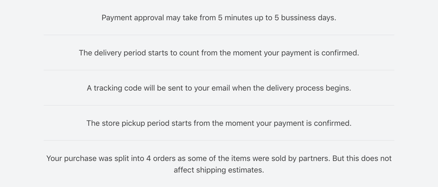
op-notices
op-noticesRenders a list of important informations relevant to the currently placed order. The messages may vary according to the type of order.
Composition: none.
Props: none.
CSS Handles:
noticesList
List ul element
noticeListItem
Each list li item element
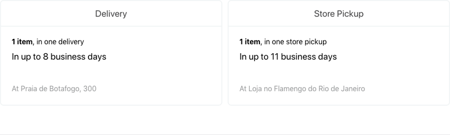
op-summary-section
op-summary-sectionIf a placed order is split between delivery and pickup, renders a summary of all pickup and delivery packages with informations such as number of items, packages, pickup/delivery address and pickup/delivery SLA.
Composition: none.
Props: none.
CSS Handles:
section--summary
Summary whole section
summaryRow
Row wrapper of both summary boxes
summaryCol
Column wrapper of each summary box
summaryAddress
Wrapper of the pickup address
summaryBox
Surrounding box of the summary
summaryBox--delivery
Surrounding box of the delivery summary
summaryBox--pickup
Surrounding box of the pickup summary
summaryContent
Wrapper of the whole content of the box
summaryItems
Wrapper of the number of items and packages
summaryShippingSLA
Wrapper of the shipping SLA information
summaryTitle
Box h5 title element
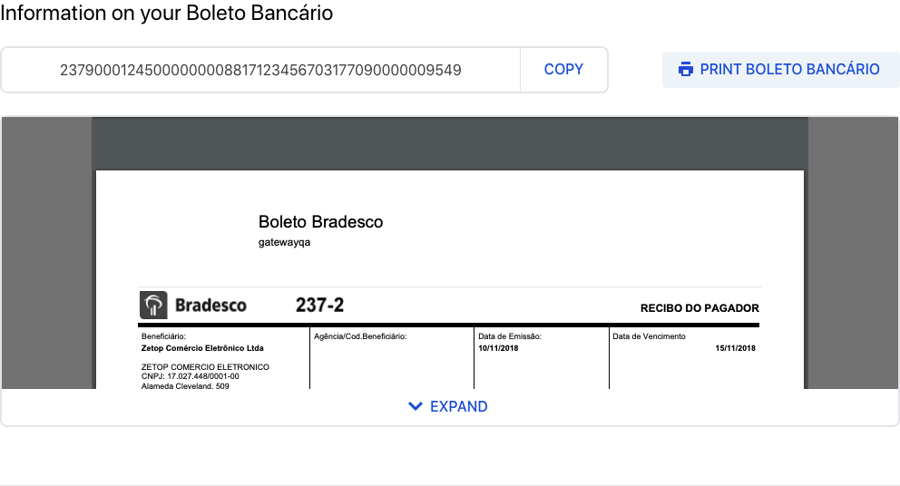
op-bank-invoice-section
op-bank-invoice-sectionRenders the bank invoice section if payment method chosen was bank invoice.
Composition: none.
Props: none.
CSS Handles:
section--bankInvoice
Bank invoice whole section
barCodeWrapper
Wrapper of the barcode number and copy button
barCodeNumber
Barcode number element
barCodeCopyButtonWrapper
Wrapper of the copy button
bankInvoiceEmbedWrapper
Wrapper of the bank invoice iframe
bankInvoiceEmbedBackground
Background of the bank invoice iframe
bankInvoiceEmbed
Embed of the bank invoice PDF
op-order
op-orderDefines an order context to be able to render its meta information and packages. Must be used to display order data.
Composition: Accepts an array of any kind of children blocks.
Props: none.
CSS Handles:
orderWrapper
Wrapper of an order meta information and packages
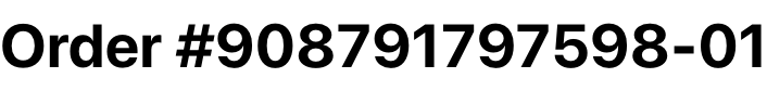
op-order-number
op-order-numberRenders the order id number. Must be placed inside an op-order block.
Composition: none.
Props: none.
CSS Handles:
orderNumber
Order number h3 element
op-order-datetime
op-order-datetimeRenders the date and time an order was placed. Must be placed inside an op-order block.
Composition: none.
Props: none.
CSS Handles:
orderDatetime
Order date and time small element
op-order-seller
op-order-sellerRenders the seller of an order. Must be placed inside an op-order block.
Composition: none.
Props: none.
CSS Handles:
orderSoldBy
Seller phrase small element
orderSeller
Seller name span element
op-order-split-notice
op-order-split-noticeRenders a message with the number of packages of an order if the order was split in more than one package. Must be placed inside an op-order block.
Composition: none.
Props: none.
CSS Handles:
splitNotice
Wrapper of the message element

op-order-customer
op-order-customerRenders the customer information. Must be placed inside an op-order block.
Composition: none.
Props: none.
CSS Handles: none.

op-order-options
op-order-optionsRenders the customer information. Must be placed inside an op-order block.
Composition: none.
Props:
fullWidth
boolean
Make the options wrapper take full horizontal space
false
myAccountPath
string
The path to redirect a user to their profile page (rendered by the vtex.my-account app).
/account
CSS Handles:
orderOptionsWrapper
Wrapper of the option buttons

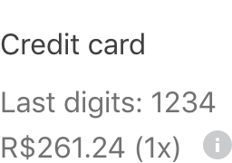
op-order-payment
op-order-paymentRenders the customer information. Must be placed inside an op-order block.
Composition: none.
CSS Handles:
orderPaymentWrapper
Wrapper of the payment methods list
orderPaymentItem
Wrapper of each payment method item
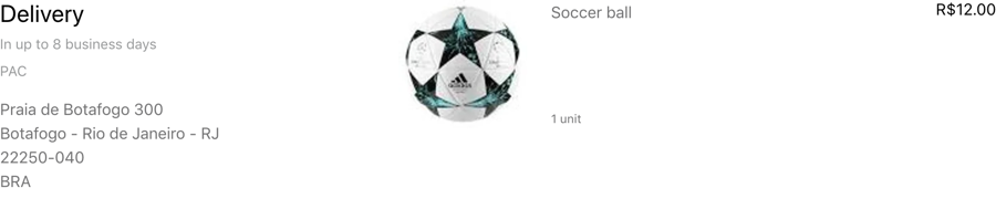
op-order-delivery-packages
op-order-delivery-packagesRenders an order delivery packages information and product list. Must be placed inside an op-order block.
Composition: none.
CSS Handles:
package
All package sections
package--delivery
The delivery package section
packageHeaderColumn
Column of header of a package section
packageHeader
Header of a package section
packageHeader--delivery
Header of the delivery package section
packageShippingEstimate
Delivery estimate small element
packageAddressWrapper
Wrapper of the package shipping address
packageAddressTitle
Wrapper of the address title
packageDeliveryTitle
Wrapper of the delivery title
productList
Product list ul element
productListItem
Product list li item element
productWrapper
Wrapper of a single product
productImageColumn
Column of a product's image
productImageWrapper
Wrapper of a product's image
productInfoColumn
Column of a product's information
productName
Product's a element
productMeasurementUnit
Product's measurement unit small element
productQuantity
Product's quantity small element
productPrice
Product's price
attachmentWrapper
Wrapper for a product's attachment
attachmentHeader
Header of an attachment
attachmentTitle
Title of a attachment
attachmentToggleWrapper
Wrapper of the toggle button of an attachment
attachmentToggleButton
Button for toggling the attachment's accordion
attachmentToggleLabel
Attachment's toggle label
attachmentContent
Attachment's content wrapper
attachmentContentItem
Each attachment's content paragraph
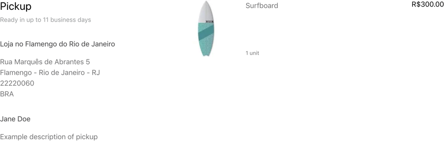
op-order-pickup-packages
op-order-pickup-packagesRenders an order pickup packages information and product list. Must be placed inside an op-order block.
Composition: none.
CSS Handles:
Note: Include the same CSS handles as op-order-delivery-packages
package
All package sections
package--pickup
The pickup package section
packageInfoWrapper
Wrapper of a pickup package's information
packageReceiver
Package's pickup receiver information container
packageReceiverName
Name of the package's pickup receiver
packageAdditionalInfo
Wrapper of additional information about a pickup package
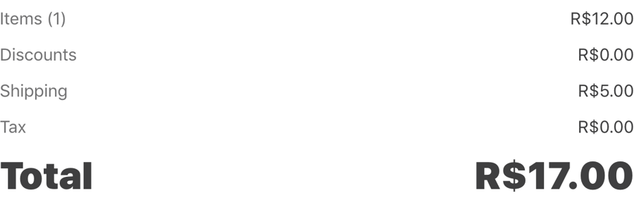
op-order-total
op-order-totalRenders an order delivery packages information and product list. Must be placed inside an op-order block.
Composition: none.
CSS Handles:
totalListWrapper
Wrapper of the total price list of an order
totalList
An order's total list ul element
totalListItem
An order's total item li element
totalListItemLabel
Label of a price item
totalListItemValue
Value of a price item
API
The order-placed app exports two hooks to allow customization using the current order data: useOrderGroup and useOrder.
useOrderGroup: used to get the data of the current order group. An order group is the collection of all orders created by an users's purchase.
useOrder: used to get the data of the current order being accessed in the order loop.
Customization
In order to apply CSS customizations in this and other blocks, follow the instructions given in the recipe on Using CSS Handles for store customization.
attachmentContent
attachmentContentItem
attachmentHeader
attachmentTitle
attachmentToggleButton
attachmentToggleLabel
attachmentToggleWrapper
attachmentWrapper
bankInvoiceEmbed
bankInvoiceEmbedBackground
bankInvoiceEmbedWrapper
barCodeCopyButtonWrapper
barCodeContainer
barCodeNumber
barCodeWrapper
confirmationIconWrapper
confirmationMessage
confirmationTitle
errorMessage
errorTitle
errorWrapper
noticeListItem
noticesList
orderDatetime
orderList
orderListItem
orderNumber
orderOptionsWrapper
orderPaymentItem
orderPaymentWrapper
orderPlacedFooter
orderPlacedHeader
orderPlacedMainWrapper
orderPlacedWrapper
orderSeller
orderSoldBy
orderWrapper
package--delivery
package--pickup
package
packageAdditionalInfo
packageAddressWrapper
packageGiftDescription
packageHeader--delivery
packageHeader--pickup
packageHeader
packageHeaderColumn
packageInfoWrapper
packageReceiver
packageReceiverName
packageShippingEstimate
packageSLA
printButtonWrapper
printHintWrapper
productImageColumn
productImageWrapper
productInfoColumn
productName
productListItem
productList
productMeasurementUnit
productPrice
productQuantity
productWrapper
section--bank-invoice
section--confirmation
section--deliveryPackages
section--notices
section--paymentMethod
section--pickupPackages
section--summary
section
splitNotice
summaryRow
summaryCol
summaryAddress
summaryBox--delivery
summaryBox--pickup
summaryBox
summaryContent
summaryItems
summaryShipping
summaryTitle
totalList
totalListItem
totalListItemLabel
totalListItemValue
totalListWrapper
Contributing
Check it out how to contribute with this project.
Contributors ✨
Thanks goes to these wonderful people (emoji key):
This project follows the all-contributors specification. Contributions of any kind welcome!
Last updated