similar-products-variants
The Similar Products Variants app returns similar products related to an SKU so users can select other colors or types of the same product.
Before you start
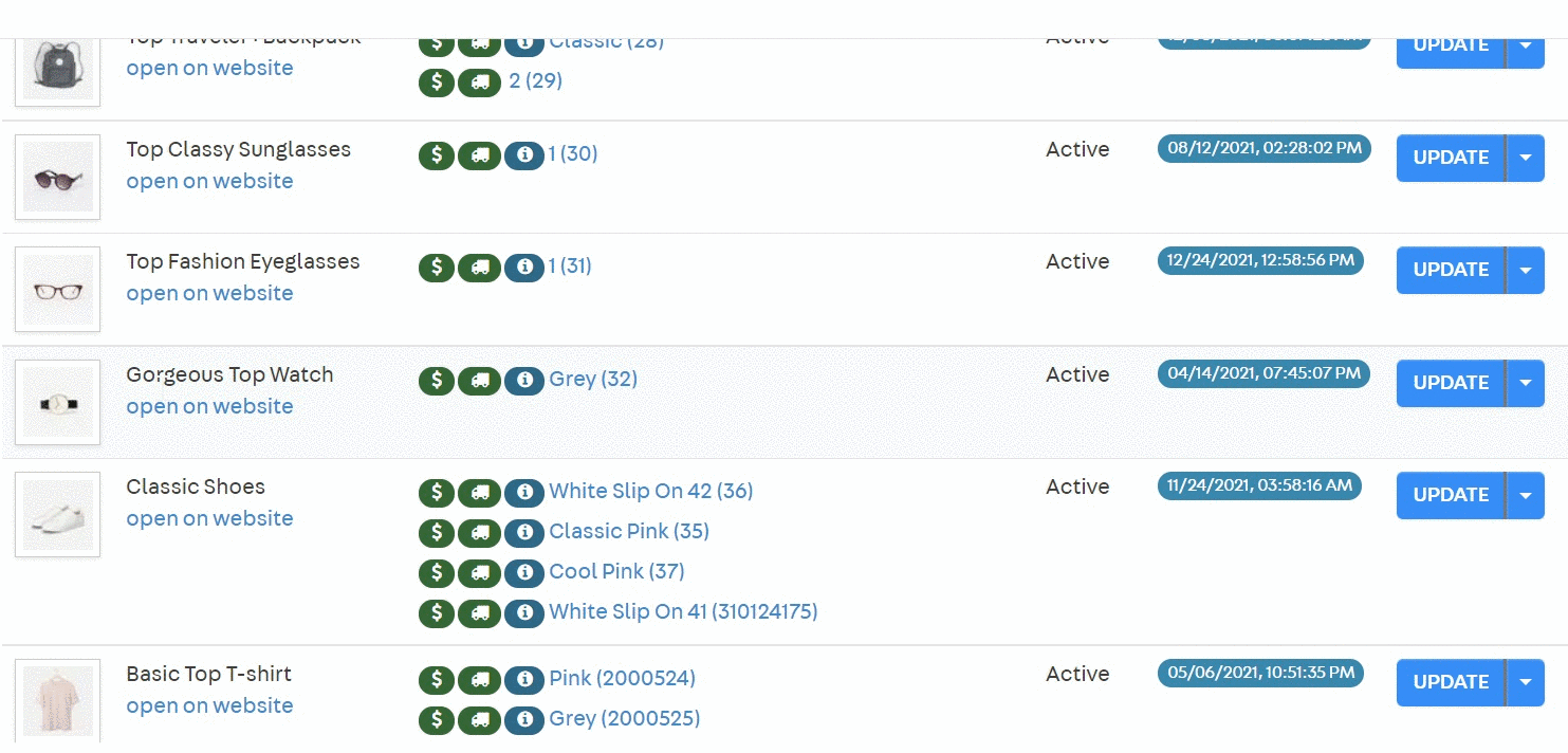
Set up similar products in your store’s Products and SKU. Access your store’s Admin and go to Products > Catalog > Products and SKU.
In Products and SKU, in the column SKU, click on the desired SKU.
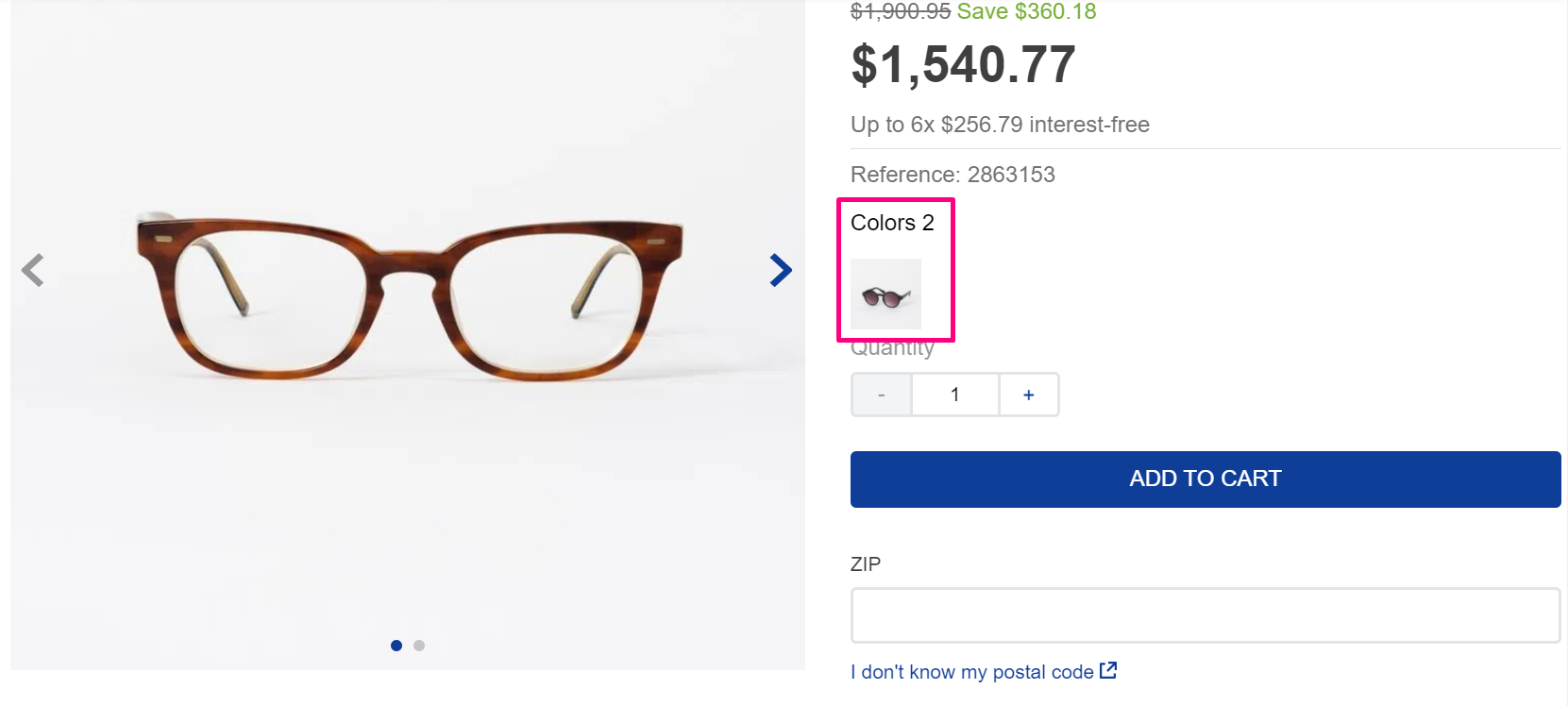
In the field Similar (Alternative Products), type the product name you desire
Then, In Products and SKU, in the column SKU, click on the one you have added in the last step.
Go to the
Imagestab, and on the fieldLabel, type a name to identify the image displayed in the thumbnail through theimageLabelprop of theSimilar ProductsVariants app.
Now, follow the app’s configuration below to show the similar products you have set up.
Configuration
Using VTEX IO CLI, install the app by running the following:
Add the
vtex.similar-products-variantsapp to your theme's dependencies in themanifest.json
Add the
similar-products-variantsblock to the product template you desire, such asstore.product, to display a similar product list.
imageLabel
String
The identifier of the image thumbnail displayed for each variant. The identifier is set in the Admin’s Catalog. If the label does not exist or is not defined, the first image is used.
null
imageWidth
Number or responsive breakpoints
the width of image.
500
imageHeight
Number or responsive breakpoints
the height of image.
null
imageAspectRatio
String or responsive breakpoints
the aspect ratio of image
null
limit
Number
Number of items to be showed before a label with rest count be showed
null
includeCurrentProduct
Boolean
If current product has to be displayed in similar list
false
You could add a
childrento change the render of items like a slider.
Customization
To apply CSS customizations in this and other blocks, follow the instructions given in the recipe on Using CSS Handles for store customization.
variants
title
var-wrap
img_wrap
img
Last updated