Product Highlights
📢 Use this project, contribute to it or open issues to help evolve it using Store Discussion.
Product Highlights
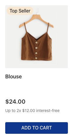
The Product Highlights app provides blocks to display highlight badges on products according to the collection or promotion they are linked to.

In the image above, the product has a Top Seller highlight.
Configuration
Step 1 - Adding the Product Highlights app to your theme dependencies
In your theme manifest.json file, add the Product Highlights app as a dependency:
Now, you can use all the blocks exported by the product-highlights app. See the full list below:
product-highlights
Parent block for defining how the Product Highlights component will be displayed, based on its children blocks (product-highlight-text and product-highlight-wrapper) and props.
product-highlight-text
Renders a span HTML tag with the highlight name. It also provides data attributes and CSS handles for style customizations.
product-highlight-wrapper
You may use this block if you need to render other blocks alongside the highlight name. It renders a div HTML tag and its children blocks, if any.
Step 2 - Adding the Product Highlights blocks to your theme templates
Copy one of the examples stated below and paste it into your desired theme template, making the necessary changes. If needed, add the product-highlights block to the template block list.
Simple example:
Example using the
linkprop:
Example using
product-highlight-wrapper:
Example using the prop
filterand the proptype:
⚠️ warning
Note that the Product Highlights blocks require a Product context to work properly, as they handle product data. Therefore, when declaring these blocks, ensure that they are in a theme template or block where this context is available, such as the
store.productandproduct-summary.shelf.
product-highlights props
product-highlights propstype
enum
The desired type of product highlight to be displayed. Possible values are: collection, promotion, and teaser. collection highlights the product's collection, so it must be used with the Collection Highlight feature. promotion and teaser should be used when the product is configured with a promotion that includes highlights. It can be used even if the promotion does not have any restrictions. On the other hand, the teaser must only be used when the promotion has restrictions. ⚠️* Note that nominal promotions will only be displayed in the cart, not on the shelf or product page.*
collection
filter
object
Defines which highlights should and should not be displayed by the block.
undefined
⚠️ Technically, the
collectionhighlight maps to theclusterHighlightsproperty; thepromotionhighlight maps to thediscountHighlightsproperty; and theteaserhighlight maps to theteasersproperty.
filterobject:
highlightNames
[string]
An array of highlight names that determine which highlights should be hidden or shown based on the type property defined in the product-highlights block.
undefined
type
enum
Determines whether the highlights for the highlightNames prop should be displayed or hidden on the UI. Possible values are: hide (hides highlights declared in the highlightNames prop) or show (only shows the highlights declared in the highlightNames prop).
undefined
product-highlight-text props
message
string
Defines the block default text message to be rendered in the UI. You can also use the Admin Site Editor and the markers prop to specify the text message that the block will render on the UI.
undefined
markers
[string]
IDs you chose to identify the block's rendered text message and customize it using the Admin Site Editor. Learn how to use them in Using the Markers prop to customize a block message. Note that a block message can also be customized in the Store Theme source code using the message prop.
[]
link
string
If this prop is set, it creates a link to the string passed. You can interpolate the variables highlightText and highlightId. Example: /collection/{highlightId}.
undefined
product-highlight-wrapper props
Step 3 - Editing the product-highlight-text messages
product-highlight-text messagesThe product-highlight-text block uses the ICU Message Format, enabling comprehensive customization of the rendered text messages.
When using the message prop, you will not need to create an advanced configuration: declare the prop directly in your Store Theme app and pass to it the desired text value to be rendered with the block.
The markers prop, in turn, requires you to add an extra configuration in the Site Editor of the Admin to properly work. When using this prop, do not forget to check out the block's message variables (shown in the table below) and the Using the Markers prop to customize a block's message documentation.
highlightName
string
Highlights the name.
Customization
To apply CSS customizations to this and other blocks, follow the instructions in Using CSS handles for store customizations.
productHighlightText
productHighlightWrapper
data-highlight-name
data-highlight-id
data-highlight-type
Contributors ✨
Thanks goes to these wonderful people:
This project follows the all-contributors specification. Contributions of any kind are welcome!
Last updated