Product Quantity
📢 Don't fork this project. Use, contribute, or open issues through Store Discussion.
Product Quantity

The Product Quantity allows users to a add a chosen amount of the displayed product in their cart.
Configuration
Add the Product Quantity app to your dependencies in the theme's
manifest.jsonfile:
You are now able to use all blocks that are exported by the Product Quantity app. Check out the full list below:
product-quantity
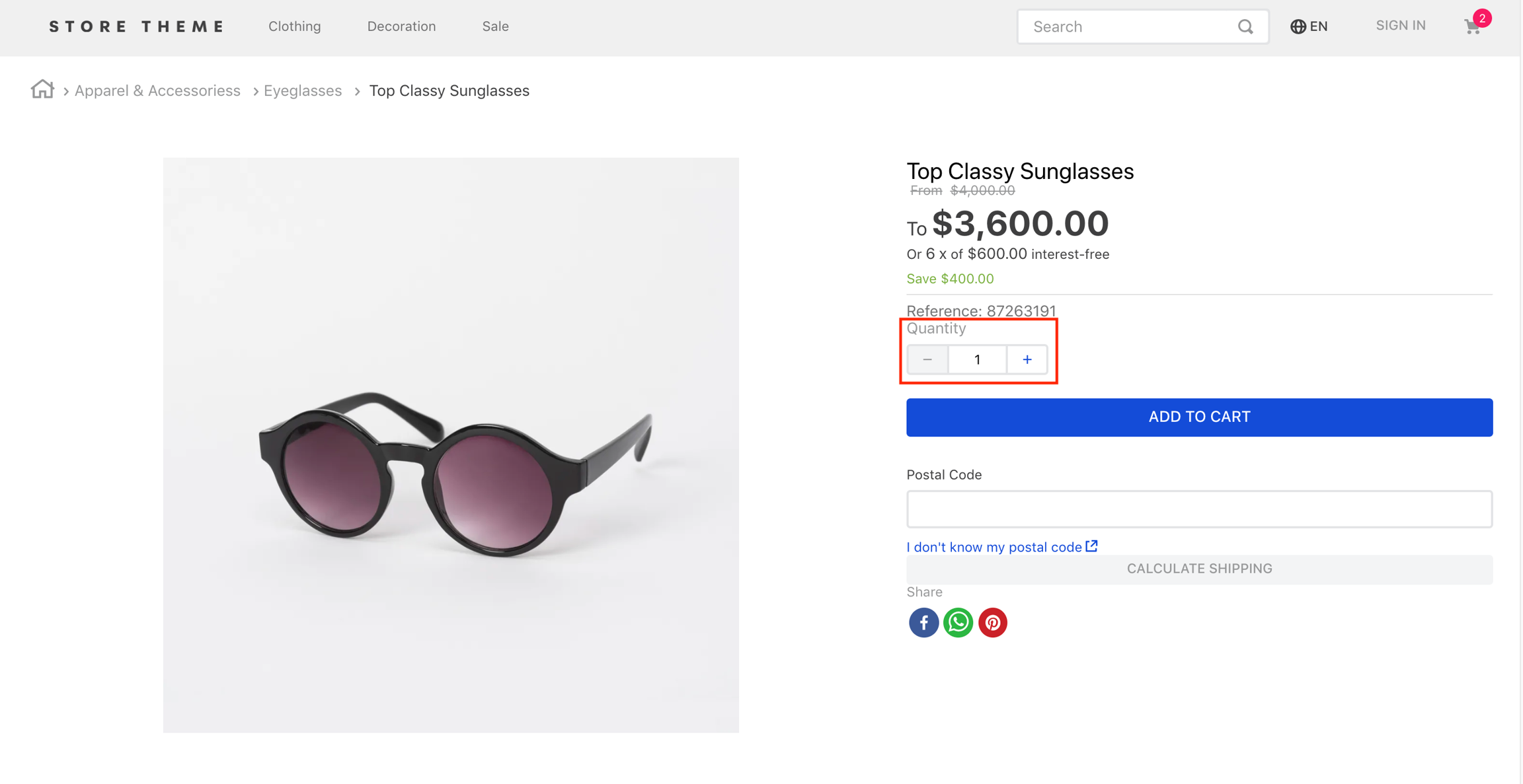
Displays a quantity selector on the product details page. This block must be declared in the theme's store.product page template.
product-summary-quantity
Displays a quantity selector on Product Summary's blocks. This block must be declared as a children of the product-summary.shelf block.
According to your desired scenario, add the
product-quantity/product-summary-quantityblocks to your theme. For example:
In the example above a Product Details Page is built using Flex Layout and the product-quantity block.
product-quantity and product-summary-quantity props
product-quantity and product-summary-quantity propswarningQuantityThreshold
number
Displays the quantity of remaining items in stock if the available quantity is less than or equal to the value given to this property.
0 (the quantity is not displayed)
showUnit
boolean
Whether the unit of measurement should be displayed (true) or not (false).
true
size
enum
Preset size values for font-size and padding. You can check these value measures by accessing the VTEX Styleguide. Possible values are: small, regular, and large.
small
showLabel
boolean
Whether a label should be displayed (true) or not (false).
true
selectorType
enum
Defines how the quantity selector should initially behave. Possible values are: stepper (displays an input field where the quantity can be directly defined, in addition to side buttons to increase or decrease the value) and dropdown (shows a list of predefined-quantity options. In case the last quantity option is selected by users, the component is replaced with an input).
stepper
quantitySelectorStep
enum
Defines how the number of products that have unitMultiplier will works. Possible values are: singleUnit (the quantity will be not affected with the unitMultiplier) and unitMultiplier (the quantity will be affected with the unitMultiplier).
unitMultiplier
Customization
In order to apply CSS customizations in this and other blocks, follow the instructions given in the recipe on Using CSS Handles for store customization.
availableQuantityContainer
quantitySelectorContainer
quantitySelectorDropdownContainer
quantitySelectorDropdownMobileContainer
quantitySelectorInputContainer
quantitySelectorInputMobileContainer
quantitySelectorStepper
quantitySelectorTitle
summaryContainer
Contributors ✨
Thanks goes to these wonderful people:
This project follows the all-contributors specification. Contributions of any kind are welcome!
Last updated